2.2. Structure of the User Interface 


The different sections of the user interface are displayed in the figure below:
Without optional areas:
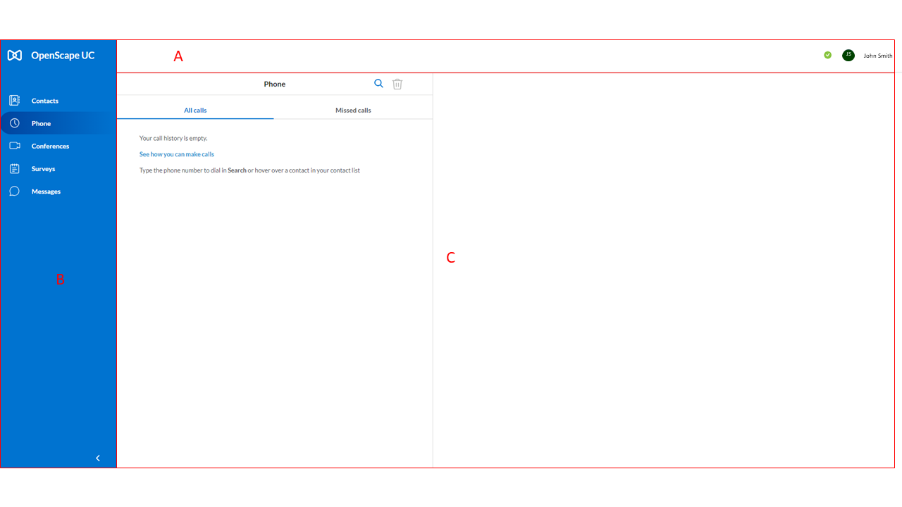
| Section | Description |
| A | Header bar - Displays your profile picture, presence
status and features that are enabled for you (e.g.
voicemail).
When you click on your profile picture, a menu
will open with additional options that allow you to access
information and settings for your account and
client.
|
| B | Navigation bar - Displays the basic navigation menu
for Unify Phone.
The following options are available on the
left menu:
The navigation can be displayed in two modes: expanded
or collapsed. In expanded mode, the left menu shows the
names of the menu items and the icons representing them. In
collapsed mode, it shows only the icons representing the
menu items.
|
| C | Display menu - Displays information related to the
option selected in the navigation bar.
In full screen mode,
the Display menu presents two sides:
- Left side: the
full list of the option selected from the navigation bar,
such as Contacts or Messages.
- Right side: the detail
for the item selected on the left side, such as a contact's
information or a chat conversation.
In mini view mode,
the Display menu presents only the right side.
|
The OpenScape Web Client is designed in a responsive web design. As a result, the
OpenScape Web
Client is adaptive to the browser size, displaying all of its components in a
mini view when the browser is restored down to a smaller size. When the
OpenScape Web Client is displayed in the mini view, the Contact Area is shown in
the Navigation Bar, while the contact details are displayed in the content area.
The left menu can be displayed in two modes: expanded or collapsed. In expanded
mode, the left menu shows the names of the menu items and the icons representing
them. In collapsed mode, it shows only the icons representing the menu
items.
‣ Parent topic: Section 2. Getting Started